How do we write alternative text for images in education?


Created in partnership with
Created in partnership with
You may also like
First of all, what is alternative text? Alternative text, or alt text, is the written description of an image that we include in online pages and documents for those who do not see it. When we write alternative text that describes the images we use in teaching or full descriptions, we remove barriers that might prevent someone who does not see the images from understanding their meaning and provide additional ways to engage with our content.
For example, a student who is blind or has low vision can use a screen reader, a tool that reads aloud what is on a device screen and helps them to navigate it. If they read braille, they can use a refreshable braille display to convert what’s on screen. When we describe images using alternative text, the screen reader or braille display will provide our description, which will ensure no one misses out.
- Spotlight guide: Make learning accessible to all in higher education
- A simple way to improve navigation in online learning
- 10 ways universities can reject ableism
Writing alternative text can help to improve cognitive accessibility, such as for those with aphasia, autism, attention deficit, dyslexia, dyscalculia or memory loss. Such students can use a screen reader or tools such as Anthology Ally or SensusAccess to convert learning materials to audio versions. Listening to the content while reading it can improve cognition and understanding.
Converting content to an audio version can also help students to fit learning into their days. For example, they might listen to content on a long commute or while doing household chores.
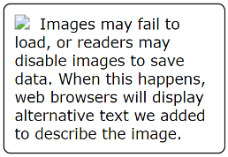
Writing alternative text can also be a way to span the digital divide. Students who use “pay as you go” internet may disable images to save on data costs (see Figure 1). When alternative text is provided for images on websites, such as the virtual learning environment (VLE), it appears instead of images when these have been disabled.
Another way to think about alternative text is to ask ourselves: what would be lost if the reader could not see an image? What would we say to fill in that gap?
So what processes and strategies can we follow to write effective alternative text for any image we use in teaching?
What should we consider when we write alternative text?
When we create alt text, we should think about:
- The context in which we use the image
- Our intended audience
- The function or purpose of that image.
If we reuse an image, our description is likely to change when any of the above is different (see Figure 2).

What’s the difference between a caption and alternative text?
Captions give a general idea of what the image depicts, but they do not describe it in detail. They might include an image attribution or a title. Alternative text describes the image based on its context, audience and function.
Writing alternative text for more complex images such as charts and graphs
When we write alternative text for an image or photograph, one or two sentences is usually enough. But what about creating alt text for more complex images such as charts or graphs? How much detail should be included?
A complex image might go further and offer more information than the text in the document. We might want students to use a graph, for example, to answer a question. Subject matter experts can write full descriptions to describe the image.
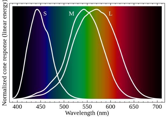
Imagine, for example, that we wish to use this graph (Figure 3) in a learning resource. It shows how the cones in our eyes detect different shades of colour. How would we describe it?
For this example, I would write a brief alternative text describing the essentials, add a caption and then provide a full description elsewhere in the document. At the end of this article, you will find a brief alternative text, caption and full description I have prepared for this graph.
Writing full descriptions
A full description of an image should include:
- The title
- The construction of the image
- A summary or overview
- A data table if relevant.
What not to put in alternative text
Why shouldn’t we use the “alternative text box” to enter full descriptions? Well, there are a few reasons not to use alt text:
- Tools such as Office only allow unformatted text for alternative text
- We often use formats such as numbered lists when describing complex images
- Writing a separate full description allows us to use all the features that benefit accessibility, such as numbered lists and headings
- A full description helps anyone to confirm our understanding of an image. We should make the full description available where everyone can find it.
How to add alternative text
While the details will vary across programs and platforms, this is the typical process to add alternative text to an image.
- Select the image
- Select the alternative text or “alt text” action
- Write your description. Keep it to about two sentences
- You do not need to write “Photo of…” unless the medium is relevant to the context, audience or function of the image
- Tick the “decorative” box when your use of the image is only for visual interest or does not add anything new to the text.
Want to learn more about writing alternative text?
In this recorded webinar, I demonstrate how to apply the techniques I discuss in this article to six example images. I also share further resources and demonstrate the process of adding alternative text.
Example of text describing a graph
Brief alternative text
Line graph illustrating that the short-wavelength, S cone mainly covers blue colours, the medium-wavelength, M cone mainly covers shades of green and yellow colours, the long-wavelength, L cone mainly covers green, yellow and red colours.
Caption
Normalised response spectra of human cones to monochromatic spectral stimuli, with wavelength given in nanometres using Stockman and Sharpe (2000) 2 degree cone fundamental plotted against sRGB spectrum.
Full description
Title: Line graph representing normalised response spectra of human cones to monochromatic spectral stimuli, with wavelength given in nanometres using Stockman and Sharpe (2000) 2 degree cone fundamental plotted against sRGB spectrum.
Construction of image: There are three lines on this graph, one for each of long- (L), middle- (M), and short-wavelength (S) cone signals. The vertical axis is labelled “normalised cone response, linear energy” and the horizontal axis is labelled “wavelength, nanometres”. The area of the graph is filled in with the standard red, green, blue colour spectrum, from left to right, starting at black, changing to blue around 450 nanometres, to green at 525 nanometres, and red at 625 nanometres, ending in black at 680 nanometres.
Summary or overview
The short-wavelength, S cone starts at 390 nanometres at zero energy, reaches maximum energy at 440 nanometres and approaches zero energy at about 530 nanometres. Its distribution shape is slightly skewed positive and predominantly covers the blue spectrum light.
The middle-wavelength, M cone starts at 390 nanometres at zero energy, reaches maximum energy at 540 nanometres and approaches zero energy from 660 nanometres. Its distribution shape is slightly negative and predominantly covers the green and yellow light.
The long-wavelength, L cone starts at 390 nanometres at zero energy, reaches maximum energy at 570 nanometres and approaches zero energy from 700 nanometres. Its distribution shape is normal and covers predominantly the green, yellow, and red light.
Matthew Deeprose is senior learning designer at the University of Southampton.
If you would like advice and insight from academics and university staff delivered direct to your inbox each week, sign up for the Campus newsletter.