A colour matrix to make visual content more accessible

Created in partnership with
Created in partnership with
You may also like
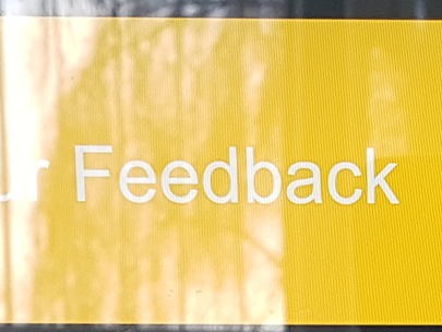
In a brightly lit lecture theatre, in a staff meeting about potential redundancies, senior leaders took us through a slide deck that used white text with a yellow background. The low-quality projector made reading this information even more difficult, and the colour choice made a tense and worrying experience much worse.
Colour is not just about branding or making graphic design appealing to the eye. Colour, and specifically contrast, can affect how clearly your message is communicated and how it is received. So, here is a technique to ensure your infographics, e-learning activities and presentations are effective and accessible.
- Spotlight: Marketing and branding that attract attention
- Ten smart ways to ace your next academic presentation
- Creating an impactful visual abstract with no design experience
Universities use a brand colour palette to make materials consistent with their valuable brand. Different combinations of these colours will produce a variety of contrasts and effects. When we present content such as text, the colour we choose should contrast clearly with the background colour. Yellow text on a white background, for example, is hard to read due to its low contrast. Dark-blue text on a white background is easier to read because its contrast is higher.
Low-contrast text presents a particular barrier to those with low vision or colour-vision deficiencies. Some people will skip over text that has low contrast because it can be too much of a strain to read it. These barriers can affect anyone in many everyday situations.
At the University of Southampton, we use accessibility guidelines and a colour matrix to help colleagues make accessible choices when using our brand palette.
How do we know how much contrast is sufficient?
The web content accessibility guidelines use a calculation to measure contrast. The result is a “contrast ratio” between the foreground and background colours. The higher the ratio, the better the readability. The guidelines state minimum levels of contrast for non-text content such as icons and functional graphics and for text content.
While many colour contrast checkers are available, the process still requires:
- entering the colours that we wish to compare (this often requires us to enter an obscure set of numbers and letters)
- understanding the results
- repeating the process for each new set of colours.
Creating a brand accessibility matrix
The table (Figure 1) shows “G” for combinations that meet the minimum level of contrast for non-text content, “AA” for combinations that meet the minimum level of contrast for text content, and “AAA” for combinations that meet the enhanced level for text content.
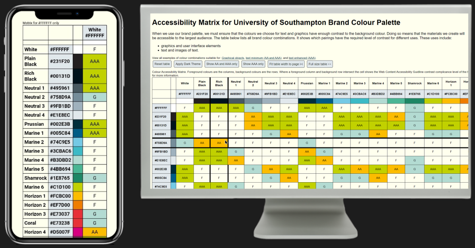
This approach makes it simple to look up colour combinations and check their contrast at a glance. Some colleagues have even printed the matrix out to put on their office wall.
How can you make your own matrix?
Contrast Grid can create a simple matrix instantly. I created my own custom matrix by using WebAIM’s Contrast Checker API and the chroma.js JavaScript library.
Refine colour choices according to likely use
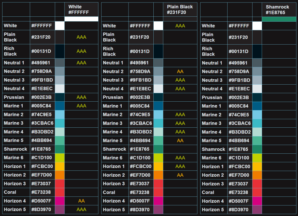
Does your organisation use a PowerPoint template? The background colour is often white. In fact, the background colour of many resources we create tends to be white or a shade of white. After filtering to show “AA” and “AAA” examples only (Figure 2), we find that our palette has seven colours that contrast well with white. Now we have a smaller set of colours we know we can use accessibly with this background colour. We found several colours in our brand that cannot be used with any other brand colour for the presentation of text.
Adding a feature to view all brand colour combinations with sufficient contrast helped those who were less familiar with the brand to find a combination that worked for their purpose.
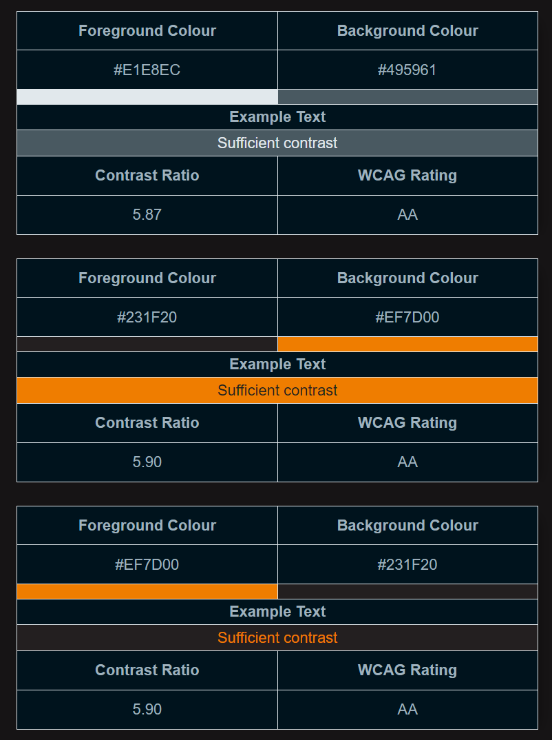
A table of colours you can use is useful, but it can be more useful to view examples.
Limitations and uses of the colour matrix
Using such a matrix is most effective when you have an older brand created without accessibility in mind.
Here are five projects helped by using the matrix – creating:
- the colour scheme for an accessible, on-brand PowerPoint template
- a dark mode, using brand colours
- an accessible on-brand theme for a virtual learning environment
- a colour scheme for an infographic
- recoloured illustrations to align with our brand.
How to reduce ‘choice overload’
To reduce potential “choice overload”, share a small set of brand colours with sufficient contrast to avoid content creators having to navigate the full range of choices. The brand accessible colour suggester (Figure 4) offers an accessible colour combination from our brand. It picks a random text colour, and three colours for graphical objects, all of which have sufficient contrast to a randomly chosen background colour.
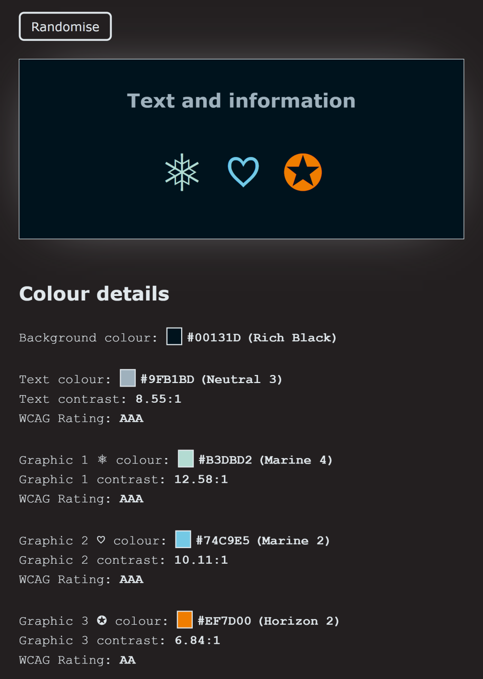
This allows content creators to keep selecting the “randomise” button to explore sets of colours they may wish to use. This has proved effective for creating on-brand colour schemes for infographics.
Making accessibility simpler and more approachable
Accessibility can seem complex to those starting their design journey. Universities can help to build awareness and change practice. Creating simple tools such as these for colour contrast is an example of how we can remove complexity and make it easier for our colleagues to create accessible content.
Matthew Deeprose is senior learning designer at the University of Southampton.
If you would like advice and insight from academics and university staff delivered direct to your inbox each week, sign up for the Campus newsletter.