10 essential tips for your next academic presentation


You may also like
Popular resources
As a presenter, your main job is to guide the audience through your argument in the clearest, most engaging, most efficient way possible. You must respect the audience’s time and attention. This means being mindful of how long your presentation is, what you’re including in your slides, and importantly, how it is all packaged and presented.
A great presenter is one who is intentional: each element in the presentation serves a clear function and is intended to support the audience’s understanding of the content.
Here are 10 tips to keep in mind to ensure your presentation hits the mark.
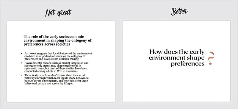
1. Any time you put something on your slides, its primary purpose is to help the audience, not you
Many presenters will add copious text or other elements to help themselves remember points they want to make. However, this is usually less helpful for the audience (most of this information belongs in presenter notes, and not on the slides). Think of yourself like a director of a movie. What do you want the audience to focus on at any given moment? What features on your slides will enhance the verbal point you are making and which will distract from it? Be intentional about what you include on your slides, and only include elements that serve a clear and helpful function for the audience.
2. Condense text to the main question or key points of the slide
It may be tempting to write out snippets of the script wholesale and add them to the slides, but this often results in PowerPoint karaoke, where the audience is simply watching you read the text out loud to them. While text is certainly useful for helping to concretise points or make slides more accessible, be judicious about what you include. Each slide should make one or two clear points. It’s better to have more slides with less content than fewer slides that are jam-packed. Of course, the amount of text you include will also be determined by the type of presentation you are giving. If students will be using your slides as a study aid, for example, you may want to include more information than if you are creating a research talk for a conference.
3. Avoid using too many colours, fonts or animations
Consider elements such as fonts, colours and animations as tools in your presentation toolkit. These elements should be used sparingly and only when they serve a clear purpose. I’m sure you’ve all attended a talk with colours bright enough to burn your retinas or crammed with “fun” fonts such as Comic Sans. Try to refrain from doing that. Animations that allow certain elements to appear or disappear along with your presentation — such as bullet points that appear as you say them — can help direct the attention of the audience. Colour contrasts are primarily helpful for visual segmentation or bringing attention to particular elements. Fonts, colours or flashy animations that are purely decorative are more distracting than helpful.

4. Avoid colour combinations that are hard to read
Be mindful of how colours interact with each other to either facilitate or inhibit comprehension. White text on black (or the reverse) is often a safe bet. Don’t overdecorate! (See above).
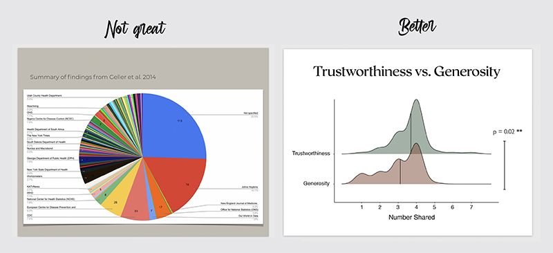
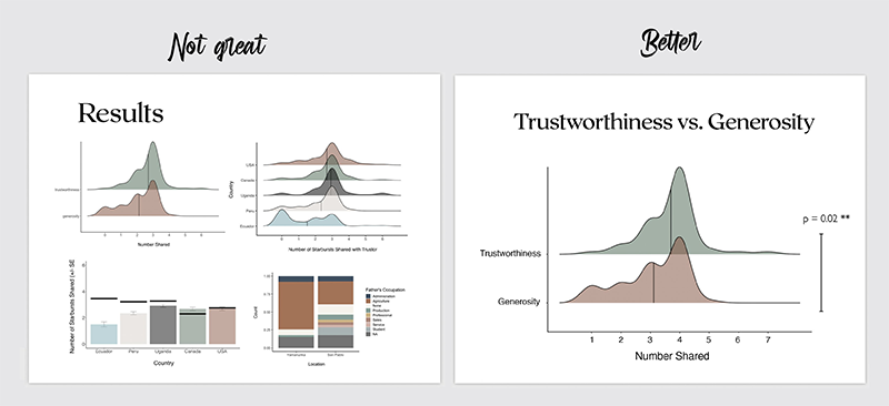
5. If you’re showing a graph, orient the audience to the axes before plotting the data and make sure they can actually see all of it
I typically show the axes and labels first, making sure to orient everyone to the variables and how they are going to be visualised, and then I reveal the data. This ensures that everyone understands how to interpret the visualisation they are about to see. It is also helpful to restate the key prediction and tell the audience what they should expect to see if the prediction is true, and then plot the data. Use large sizes and clear fonts. I’ve heard way too many people say things like: “You probably can’t read this but…” To that, I want to say: “But you’re the one making the slide! You did this to us!” Don’t be that person.
6. Use high-resolution images or videos
This is especially true for presentations that will be projected onto a larger surface. If it’s fuzzy on your computer screen, it will look even fuzzier when magnified and projected. Try to integrate high-resolution images and vector graphics to avoid this. When your images contain text, delete those portions and re-enter the text in text boxes that will scale up much more clearly when magnified.
7. When illustrating results, identify one or two key graphs to make your point
The temptation is often to show the audience every single result you found, but this dilutes the overall message you are trying to send. There’s no need to visualise everything: you should focus on the key graphs that tell most or all of the story. If you have built up the presentation in the right way, when the audience see your data visualisation, they will immediately understand what you found and whether it supports your hypothesis. That’s how clear and accessible the graph should be.
8. Don’t overload the audience with unnecessary complex jargon or acronyms
Every time you introduce a new term or a brand new acronym (BNA), you are asking the audience to do you a favour and commit this new item to working memory. The audience doesn’t know your presentation; they don’t know what’s going to be important later and what isn’t. They’re trusting that you are only presenting information to them that is relevant and they’re doing their best to follow along. Make this process as easy and enjoyable as possible for them. Be judicious with what you ask them to remember or commit to memory. If you can explain a concept without jargon, avoid the jargon!
9. Enhance accessibility
The Web Accessibility Initiative has a great set of guidelines that I will summarise here. Use easy-to-read fonts in large sizes. Make sure there is enough contrast between colours to make them discernible. When giving virtual talks, consider turning on automatic closed captioning. If it’s feasible, provide annotated slide handouts. During the presentation itself, speak clearly and loudly, avoiding unnecessarily complex vocabulary or culturally specific idioms. Where possible, use a microphone. You should also try to verbally describe pertinent parts of visual information on your slides, such as graphics or videos.
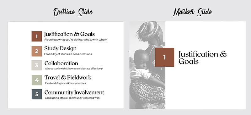
10. Use outline slides and marker slides to segment information
Research shows that we understand and remember information better when it comes in bite-size pieces; think of chapters in a book. To incorporate this structure into your talk, break apart the presentation into smaller pieces. Always incorporate an outline slide that previews the structure of the talk and gives the audience a sense of what to expect. Also, use marker slides to communicate that a new section is beginning. And make sure to wrap up each section with a summary slide.
Dorsa Amir is a postdoc in the department of psychology at the University of California, Berkeley.
If you would like advice and insight from academics and university staff delivered direct to your inbox each week, sign up for the Campus newsletter.