Creating an impactful visual abstract with no design experience


You may also like
Digital visuals have become our canvas in the information age. One popular method of communicating science and knowledge is through visual or graphical abstracts, which offer a concise pictorial summary of the main findings of an article. Visual abstracts (VA) rarely receive the attention they deserve from researchers, whose minds are more focused on perfecting scientific nuances. The internet is helpful when creating a visual abstract but less so for making the design appealing. Just search for “how to create a visual abstract” and you’ll find blogs, articles, videos and a lot of instructions. However, information returned on “design principles” can be overwhelming, complicated to implement and confusing.
When you’re a beginner, it’s tricky to draw parallels between science visualisation and design basics. Without design skills, creating an appealing visual may take a lot of trial and error, and – like it or not – a research trainee doesn’t have that kind of time.
- THE podcast: pointers on writing and publishing for academics
- A guide to writing grant proposals
- Work like a scientist, don’t sound like one
Thankfully, you don’t need to be a designer to distinguish a good design from a flawed one or to create your own effective design. I’ve compiled a set of key design principles (in no particular order) that can be followed to create an impressive, eye-catching and easy-to-understand VA.
Movement: how the reader’s eye moves
Movement refers to how your eye travels through a composition. You can equate this with story flow in a scientific VA. Place visual elements (such as headings, images or arrows) so they are read in the order you intend. Eyes will naturally fall on a certain area of your VA. However, you can guide the direction by placing visual elements along the path of the most natural eye movement – top to bottom, left to right.
Emphasis: what will the reader see first?
With movement comes emphasis. Decide what grabs your readers’ attention first – the title, the conclusion or the process – and make it the focal point of your VA. Other ways to add emphasis include increasing size of the visual elements such as text or image, bold text, striking colour, positioning in the centre or highlighting with a background colour.
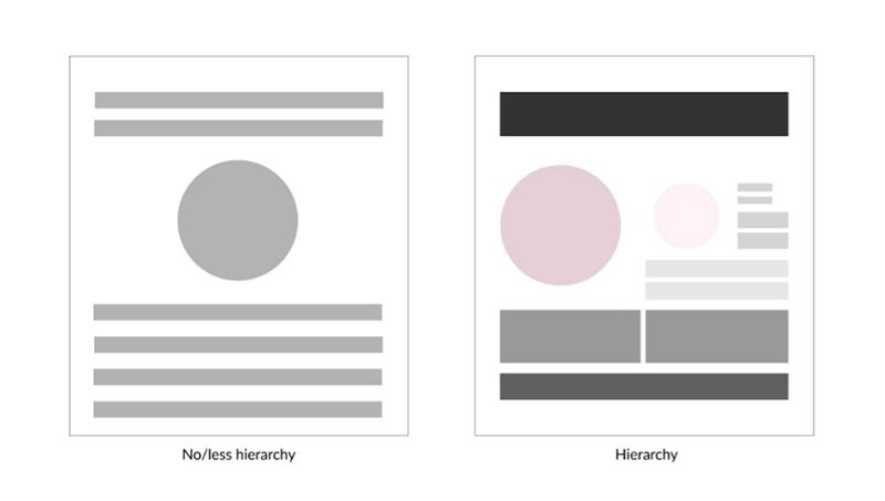
Hierarchy: the order of importance of elements
A composition must have a hierarchy. Once you emphasise one element, use visual cues to guide readers to what should follow next – a subtitle, an image or a conclusion? Here, design elements such as arrows and flow charts can be helpful if finding a natural flow is difficult. To achieve visual hierarchy, scale the size of elements or add colours. Use typeface (for example, Times New Roman or Arial), text size or font weight (regular or bold) to create typographic hierarchy.
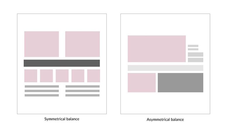
Balance: create visual harmony
By default, our eyes prefer harmony and balance. Almost always, an asymmetrical or unbalanced layout will be jarring. In a VA, you must balance heavy elements with lighter elements. For example, two images can balance each other out or the text on the right can even out the image on the left.
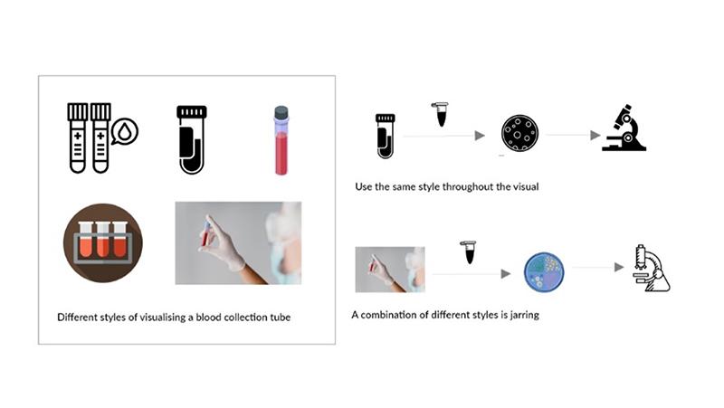
Unity: use a consistent style
Unity is how well all the visual elements work together. In a VA, one way to achieve unity is to select a similar style of graphic elements. They could be photos, illustrations, icons or even simple shapes. Select one style and keep it consistent throughout.
Alignment: right, left or centre?
There’s no mystery about text alignment. However, in a VA, everything should be aligned properly to each other, including text, images, arrows and other elements. Non-aligned graphic elements introduce chaos to the composition. Make your margins consistent, and align your graphic elements uniformly, whether you position them left or centre.
White space: avoid clutter
White space or negative space is all about what you don’t add – the space between design elements. Allowing breathing room can enhance your visual composition’s hierarchy and movement. Don’t clutter your VA. Tip: don’t reduce the font size or the line or paragraph spacing to squeeze in more text.
Contrast
Contrast is what makes a VA design “pop”. Contrast creates space and difference between design elements, making them stand out from one another. For instance, if your VA has a background colour, it should be different from other elements so they all work harmoniously and are legible. The right contrast promotes accessibility. Don’t forget that contrast can also be achieved with different sizes of elements, shapes or fonts.
A few design tips
- Fonts express emotions. Science communications shouldn’t elicit fear or laughter. Select typefaces such as Arial, Times New Roman or Lato.
- Don’t use more than two typefaces. Adding more fonts dilutes your design and reduces contrast.
- Use natural scale unless it is necessary to dramatise a point, which largely depends on the story and audience. For example, a cellular receptor should not be larger than the cell, and a virus should not be larger than the lung it infects.
- Use colour sparingly or use muted colours. (Download our resource document for colour advice.)
- Use a grid to help maintain white space, alignment and hierarchy.
- Always get different sets of eyes to check your final design.
- Review your VA in greyscale to check that it is readable and contrast-free.
Storytelling through graphics and visuals helps us to absorb information and to learn faster. Perhaps that’s why scientific concepts visualised by artists and illustrators are well remembered and why a VA effectively communicates your research.
I hope this quick overview gives you more confidence to begin your VA design. Remember to observe, learn and be inspired by designs from other realms.
Lipsa Panda is communications manager for STM Journals at Elsevier.
If you would like advice and insight from academics and university staff delivered direct to your inbox each week, sign up for the Campus newsletter.
Additional Links
Curious to know more? You can find lessons on colour, typography and design psychology in the webinar “Article to art: creating visual abstracts” hosted on Researcher Academy. In addition, you can download a bonus document that lists design guidelines and free resources available online.
Researcher Academy offers informative e-learning modules on a wide range of topics to support you along your research journey. If you have a topic in mind that you would like us to cover, or have questions, please write to us at the Researcher Academy Support Center.