Academics fed up with logging into staff portals, virtual learning environments or other digital platforms might not just be yearning for simpler analogue times.
Instead, their aversion to myriad online systems might be explained by a rather more unusual reason recently suggested by an Australian researcher who proposes that “digital dashboards” are an unwelcome reminder of academia’s patriarchy, or, as she describes it, the ideal of the “phallic lecturer”.
Writing in Gender and Education, Lucinda McKnight, lecturer in education at Deakin University, explains that she had long struggled to explain her loathing of digital dashboards, which caused her to “feel something…beyond surliness, beyond queasiness” whenever she logged into her institution’s portal.
In her paper, “Meet the phallic lecturer: early career research in a neoliberal imaginary”, Dr McKnight alights on the striking phrase to explain her “ambivalences and…bile” against the “single screen used by staff thousands of times per day”.
“The phallic lecturer is the imagined person for whom the screen, officially called the dashboard, is created,” she explains.
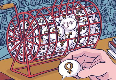
The mainly “masculine” icons displayed on Dr McKnight’s digital dashboard, for example, reinforce the sense that academia is a profession governed by and set up for men.
“Many of the [icons are] designed with diagonal elements for priapic dynamism, star arrows, tick boxes, test tubes, thumbs pointed up, keys, gear cogs and magnifying glasses,” she says, adding that the “only ‘feminine’ icon is the…ubiquitous heart in the bottom right corner of each tile”.
The language of the “digital dashboard” is also innately sexist given its association with motor vehicles, contends Dr McKnight, a former software developer, who explains that “the dashboard is generally culturally employed as a masculine trope [even though] people of all genders drive”.
“Imagine a vice-chancellor saying ‘I’ll just log into my sewing basket and check the time of that meeting’,” suggests Dr McKnight of a potential alternative name.
The centrality of “tumescing” line graphs or bar charts within these dashboards, generally used to indicate success in research publication or citations, also has a phallic symbolism, she adds. Researchers are encouraged to become “thrilled [by] precious millimetres of extra length [added] to [their] columns”, while Dr McKnight admits that she too worries if “my column dick will never visually get any bigger”.
Making digital dashboards more feminine would be a good step in suggesting a “different, less linear world, where gender is less strident [and] where nature is not extinguished”, she concludes.
POSTSCRIPT:
Print headline: Heads-up display is a turn-off
Register to continue
Why register?
- Registration is free and only takes a moment
- Once registered, you can read 3 articles a month
- Sign up for our newsletter
Subscribe
Or subscribe for unlimited access to:
- Unlimited access to news, views, insights & reviews
- Digital editions
- Digital access to THE’s university and college rankings analysis
Already registered or a current subscriber?