International student mobility has become one of the most keenly watched topics for statistics in recent years as globalisation has impacted higher education.
Figures from the Organisation for Economic Cooperation and Development’s main annual report on education published earlier this autumn neatly highlight the trends in terms of where these mobile students come from, where they study and the qualifications they are seeking.
However, according to the Education at a Glance report, the global explosion in the numbers of international students has been tailing off in the last few years after exponential growth from the late 1970s to 2010.
In 1975, there were approximately 0.8 million students enrolled in tertiary education worldwide who were not citizens of the country they were studying in. From 1995 to 2010 this figure shot up from 1.7 million to 4.2 million, but only increased 0.4 million in the subsequent five years.
The geographical spread of these students, both in terms of their origins and destinations, shows how the major trend has been for Asia to be main “sending” region: in 2015 it is estimated that 1.56 million international students on courses in OECD countries came from Asia. Three-quarters of these students converged towards only three countries: the US (44 per cent), Australia (16 per cent) and the UK (15 per cent).
The second major region of origin of international students is Europe, with 782,000 seeking study abroad, followed by the Americas (265,000) and Africa (254,000), according to the report.
However, European student flows take place, as might be expected with schemes such as Erasmus, much more within the region than other parts of the world.
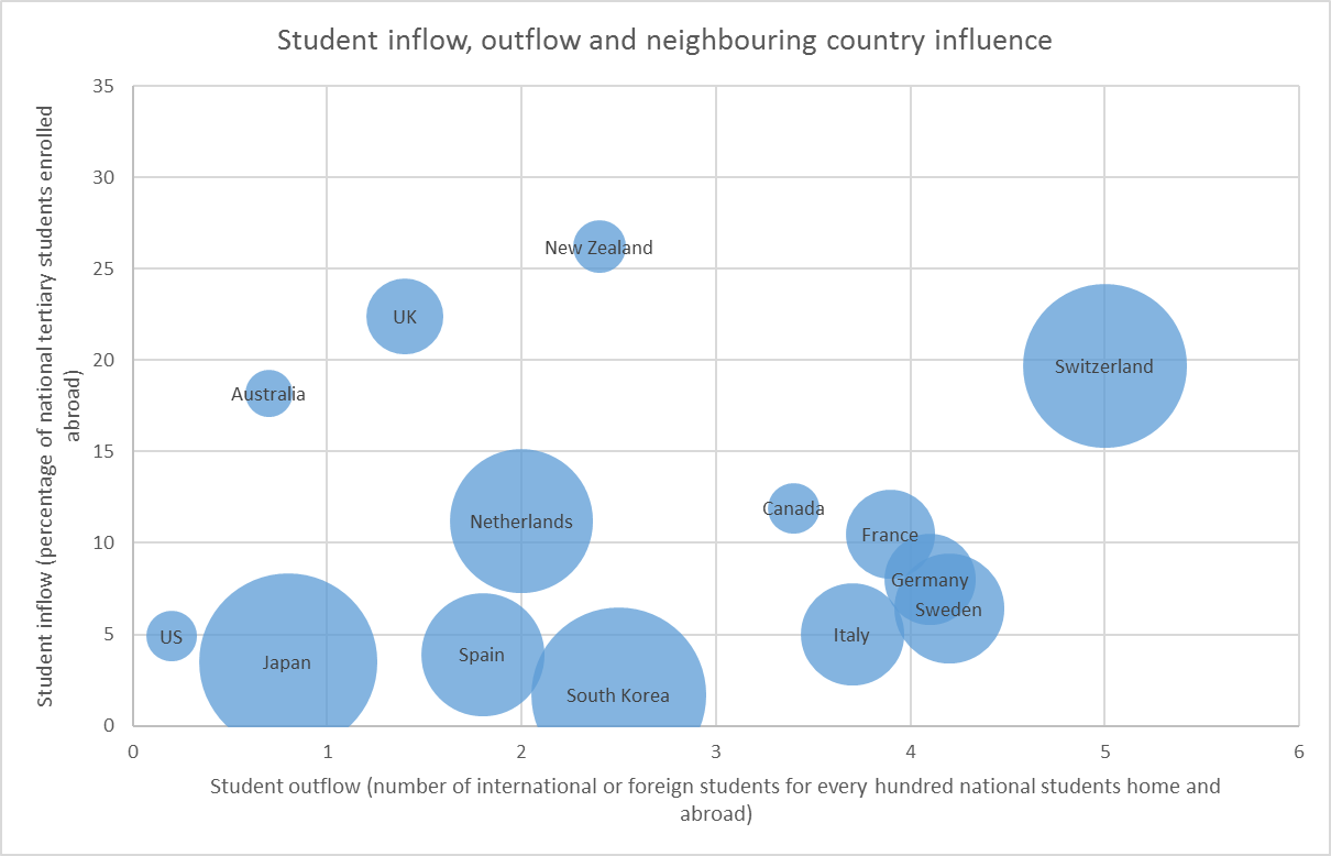
Some of the highest outflows of students from a country relative to inflows are seen in European Union countries, as shown by the following graph. The size of the bubbles meanwhile show which countries have the greatest share of international students from immediate neighbouring nations.
Meanwhile, this chart shows how there are sometimes striking differences in the share of international students in OECD countries for different levels of higher education.
France and Switzerland, for instance, have a much greater share of their doctoral students from other countries than at either master’s or bachelor’s level. However, Australia and Germany see more internationalisation in their master’s cohorts.
Find out more about THE DataPoints
THE DataPoints is designed with the forward-looking and growth-minded institution in view
Register to continue
Why register?
- Registration is free and only takes a moment
- Once registered, you can read 3 articles a month
- Sign up for our newsletter
Subscribe
Or subscribe for unlimited access to:
- Unlimited access to news, views, insights & reviews
- Digital editions
- Digital access to THE’s university and college rankings analysis
Already registered or a current subscriber?
