Phil Baty and Benjamin Hennig put the rankings results into human and economic perspective
Click image to enlarge
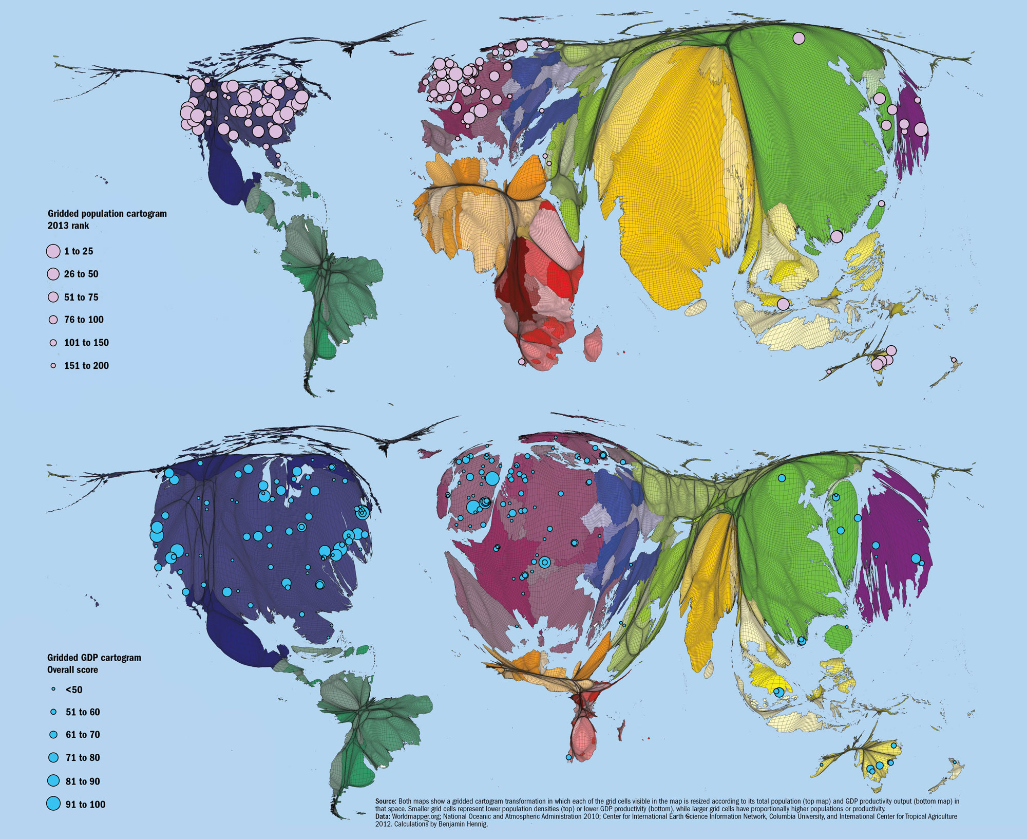
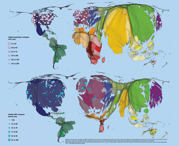
It is clear that the world’s best universities are overwhelmingly concentrated in the developed world (with most of the top 200 found in North America and Western Europe), but these two heavily distorted world maps are designed to put the results of the Times Higher Education World University Rankings 2013-2014 into a clearer global context.
The images – known as gridded cartogram transformations – look at the top performing universities in relation to the size of each country’s population (see the top map on the image below) and economic productivity measured by gross domestic product (see the bottom map on the image below).
The maps have been created exclusively for THE by Benjamin Hennig, senior research fellow at the School of Geography and the Environment at the University of Oxford, who says they put the rankings “into the perspective of the human and economic shapes of the world”.
Consider the population map. The land area is resized so that each space in the map relates to an equal number of people no matter where you look. Sparsely populated spaces shrink in size, highly populated areas expand, while the underlying grid ensures that the geographic location of each area is preserved. This allows us accurately to map the locations of the top 200 universities into these transformed spaces.
On this map, the pink circles represent THE’s world-ranked institutions. The largest circles represent universities in the top 25, while the smallest represent those ranked from 151st to 200th.
In the GDP map, the land area is resized so that each space relates to an equal amount of output, so less economically active areas (as measured by GDP, not by people’s real activity) shrink. Here, the blue circles represent THE’s world-ranked institutions but according to their overall scores (not their rankings positions, as with the population map). The largest blue circles represent those institutions scoring between 90 and 100 points overall, with the smallest representing those scoring under 50 points.
Hennig says: “In the wealthy parts of the world, we see a more even distribution of the top academic institutions, while at the same time the GDP map shows that there are some more clustered patterns even in the ‘developed’ world when it comes to their locations in relation to economically active spaces.
“Huge global inequality becomes highly visible in these maps, as they do not show land area, but rather where people live and work – and where they are more excluded from access to ‘top’ education, even in the emerging economies and most populated countries of China and India.”
Register to continue
Why register?
- Registration is free and only takes a moment
- Once registered, you can read 3 articles a month
- Sign up for our newsletter
Subscribe
Or subscribe for unlimited access to:
- Unlimited access to news, views, insights & reviews
- Digital editions
- Digital access to THE’s university and college rankings analysis
Already registered or a current subscriber?