What are the essential ingredients needed to make a world-class university? As the editor of Times Higher Education’s World University Rankings for the past seven years, this is a question that I’m asked very often.
The answer always involves a discussion of the importance of institutional autonomy and academic freedom, and a recognition of the crucial fact that without great people, there can be no great university. But one element is undeniably more important than any other: cold, hard cash.
You can’t establish or sustain a world-class university without “abundant resources” (as former World Bank tertiary education specialist Jamil Salmi puts it).
You can’t create the appropriate research facilities, or provide the appropriate teaching environment, without money – but most importantly, you can’t attract and retain the required talent in a highly competitive global recruitment market without the resources to pay attractive salaries.
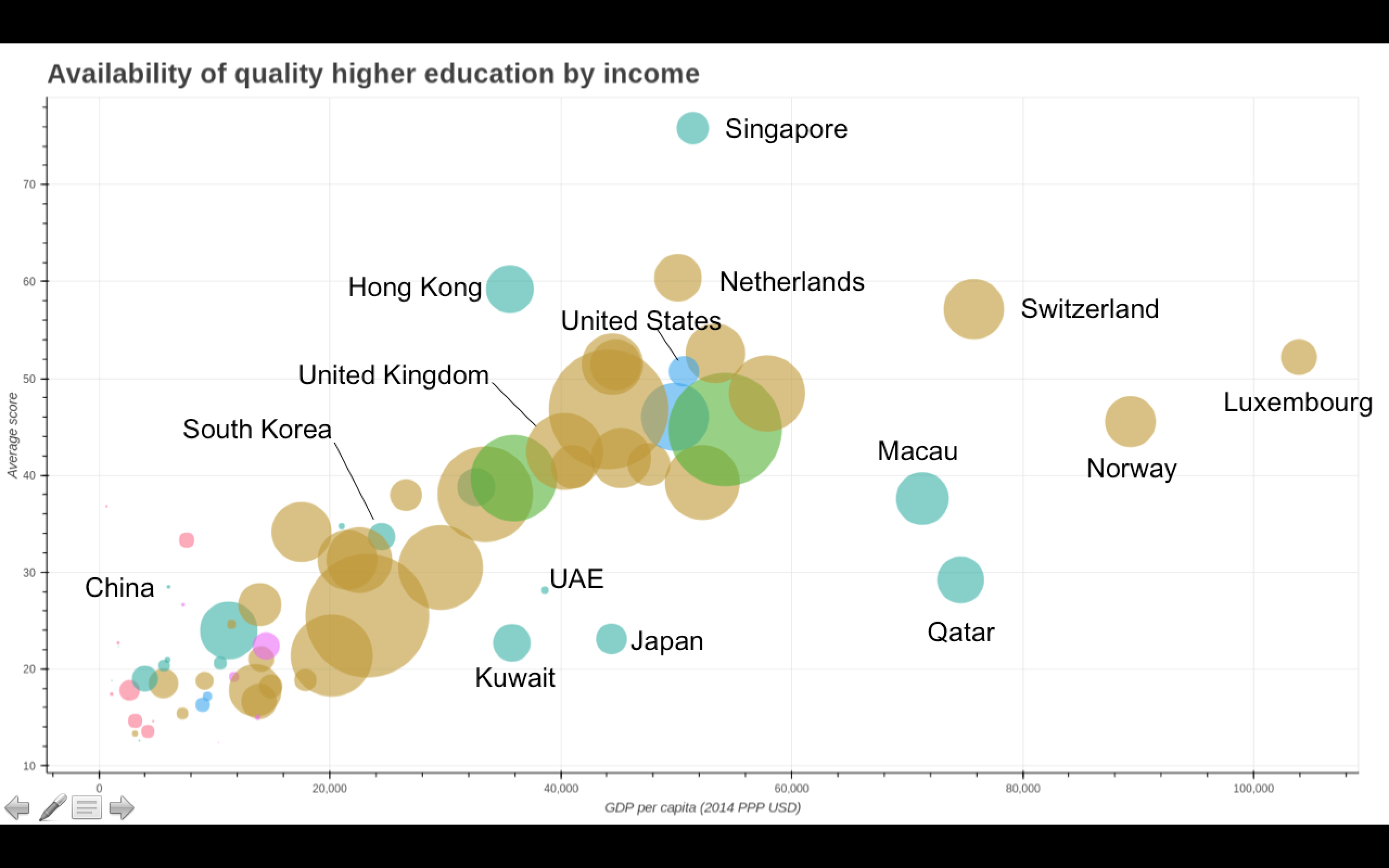
The fact that money talks in global higher education seems to me to be self-evident, and indeed, the rankings data provide clear evidence. The graph below shows the clear correlation between resources and an institution’s standing in the university rankings.
But the full extent of the relationship between wealth and world-class universities becomes shockingly stark in a series of powerful new images created for Times Higher Education by Ben Hennig – an associate professor in the Faculty of Life and Environmental Sciences at the University of Iceland (who is responsible for this brilliant website).
The images, due to be presented at the British Council’s Going Global this week, are known as gridded cartogram transformations.
In the image below, Hennig has reshaped the map of the world to show national wealth, measured by gross domestic product. The land area in each country has been resized to reflect economic output. You see, for example, North America and Western Europe bulging to dominate the world map, while the entire continent of Africa virtually disappears. On this new world map, Hennig has plotted all the universities in the THE World University Rankings – with the larger, red dots representing world’s top 50 universities.
![]()
But Hennig’s second map is even more eye-opening. For this, he has reshaped the world to show population size, plotted against the world’s top research universities according to the THE World University Rankings.
![]()
Here you can see extreme concentrations of top universities in the rich but relatively less densely populated continents of North America and Europe, while vast swathes of the world’s population have limited, or often no, access to top-ranked research universities.
The implications for global economic development, and for global equality, are profound.
Phil Baty is Editorial Director, Global Rankings at Times Higher Education. His session at Going Global, World rankings data reveals the next knowledge hubs, is at 9.30am on 23 May.
Register to continue
Why register?
- Registration is free and only takes a moment
- Once registered, you can read 3 articles a month
- Sign up for our newsletter
Subscribe
Or subscribe for unlimited access to:
- Unlimited access to news, views, insights & reviews
- Digital editions
- Digital access to THE’s university and college rankings analysis
Already registered or a current subscriber?